Welcome to the Test-UI category! This post is designed to test how images, headings, and text look inside a real blog article. We’ll be experimenting with the 2:3 aspect ratio featured image and overall layout to make sure future posts on Keto Comfort Kitchen Recipes look perfect.
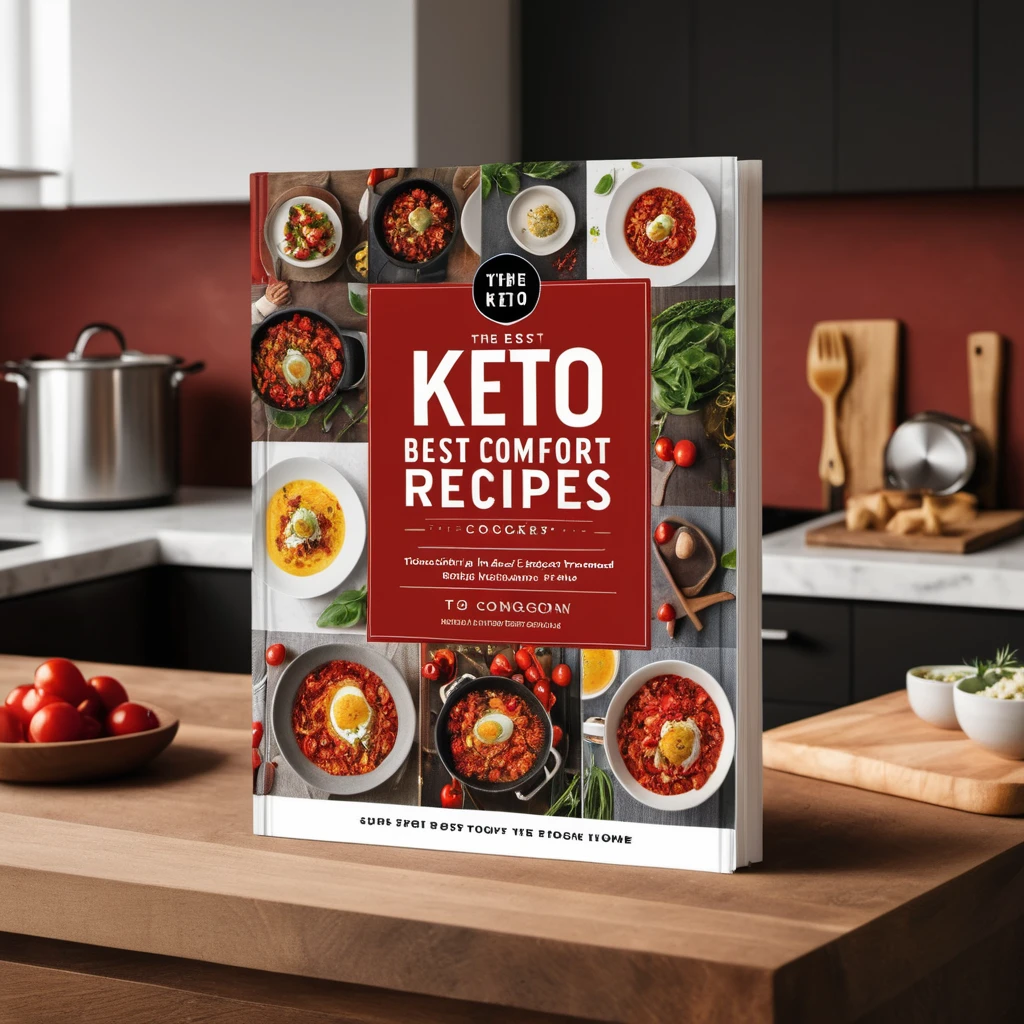
Section 1 – Featured Image Test
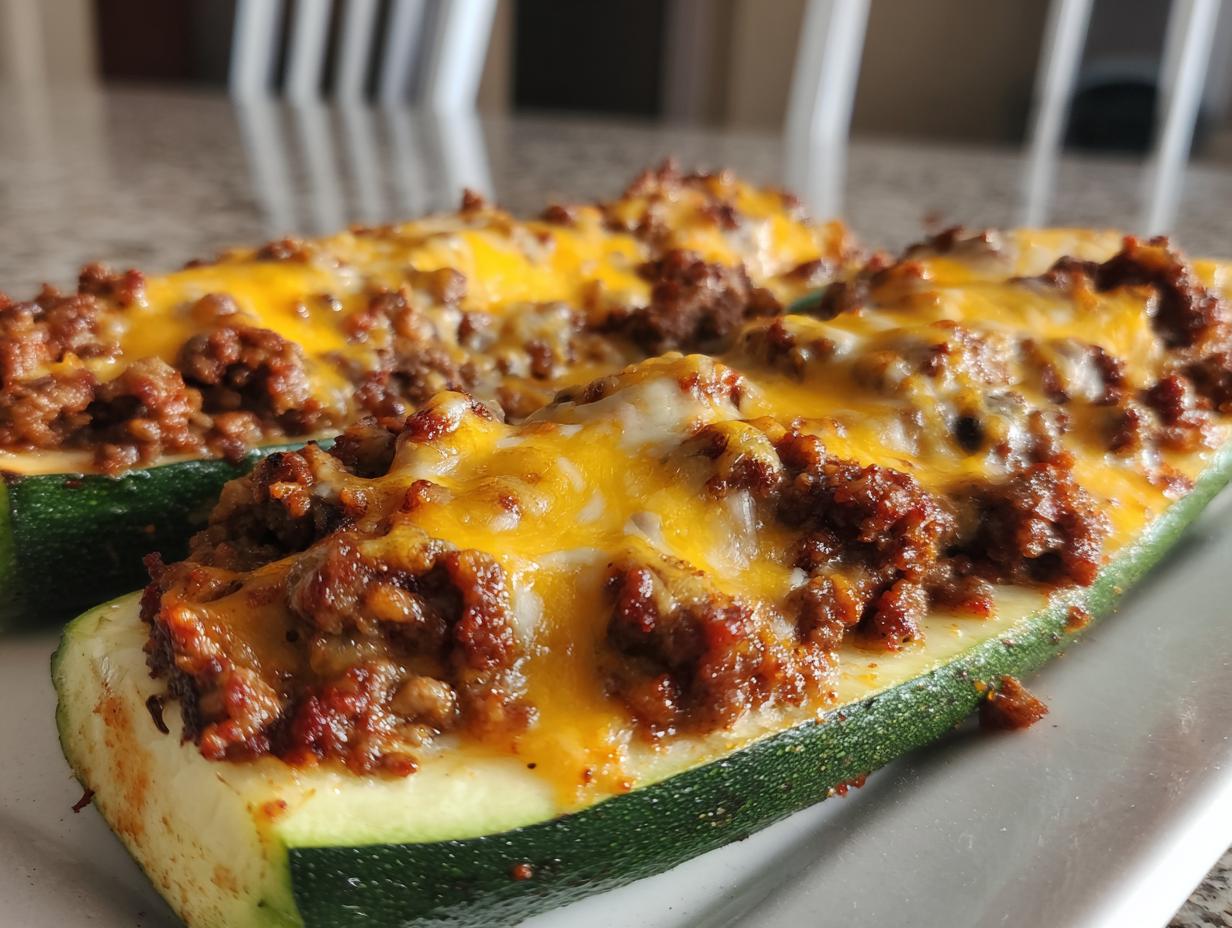
Here we insert the main featured image for the post. The goal is to see how a 2:3 aspect ratio photo of a chicken broccoli casserole fits within the design. We’re testing margins, spacing, and overall alignment.
Section 2 – Heading & Text Flow
This section tests how multiple headings, short paragraphs, and keywords appear on the page.
- The focus keyword here is Keto Chicken Broccoli Casserole.
- We want to see how bold text, italics, and bullet points display.
- Internal linking will also be tested in future drafts.
Section 3 – Image in Content
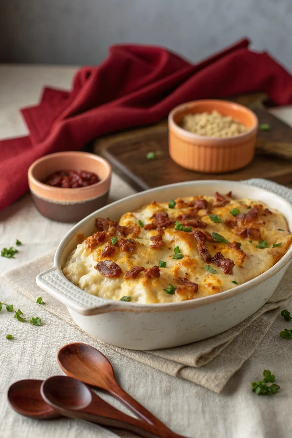
Below we test adding a second image inside the post content. This helps us check how images look when aligned with text, captions, and white space.
Sample Image Placeholder:

Section 4 – Conclusion
This concludes our test post. Remember, the purpose of the Test-UI category is not to publish recipes, but to ensure that each post layout, aspect ratio, and image design works perfectly with the blog’s overall style.